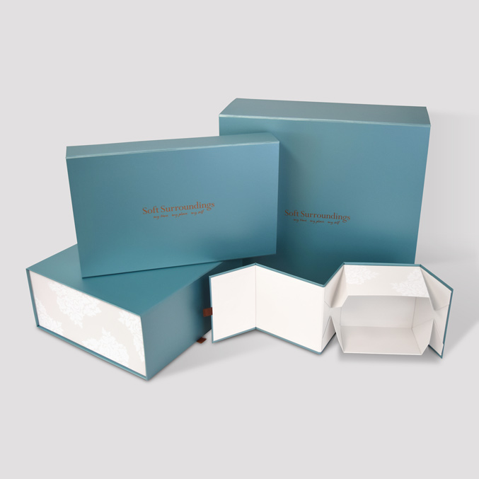
subject: What Artwork Mistakes Commonly Affect Printed Rigid Boxes? [print this page]
Prepress artwork errors can quickly derail a packaging production run, leading to misaligned wraps, skewed foil stamping, or color shifts across panels. Because rigid box manufacturing involves wrapping printed paper or specialty stock around heavy chipboard, artwork setup requires a slightly different approach than standard folding cartons. Here are a few common artwork pitfalls that frequently impact structural quality and print fidelity during production.
1. Inadequate Bleed Along Wrapped Edges and Hinging Points
Unlike flat folding cartons, rigid packaging requires extra bleed allowance to accommodate how paper wraps around thick board edges and tucks into the inner walls. When designing artwork for magnetic closure rigid boxes, failing to extend background colors or pattern fills past the outer cut lines often results in raw white paper edges showing along the hinged lid joints or closure flaps. Standard 1/8-inch bleeds are rarely enough for wrapped boards; structural engineers typically require 1/2-inch to 3/4-inch wrapping bleeds depending on board caliper and inner turn-ins.
2. Disregarding Crease Lines and Thickness Take-Up
Rigid chipboard has physical depth (often 1.5mm to 3mm thick). When flat wrapped paper folds around these thick corners, the outer surface stretches while the inner surface compresses. If critical text, small logos, or fine border artwork are placed too close to a fold line on sleeve rigid boxes, the design will visibly shift or get pulled off-center once the outer sleeve is wrapped and glues down over the inner tray. Keeping text and key design elements at least 5 mm away from structural score lines helps prevent shifting visual alignment.
3. Misaligned Spot UV or Foil Stamping Dies
Foil stamping and raised spot UV add high-end tactile value to rigid gift boxes, but vector alignment errors on prepress files can ruin the effect. A frequent issue occurs when the foil mask in the artwork file is not mapped to the exact vector coordinates of the base print file. Because foil is applied in a separate pass using heated brass or copper dies, even a 0.5mm misalignment causes colored ink borders to peek out from beneath the stamped foil. Always supply foil and UV masks on dedicated vector layers set to 100% solid spot colors with overprint enabled.
4. Color Profiles and RGB-to-CMYK Conversions
Rich, saturated background graphics look vibrant on backlit digital monitors, but converting RGB artwork to CMYK right before export can flatten deep tones or cause unexpected color shifts especially in dark blues, rich purples, and deep blacks.
Furthermore, using a simple single-ink black (100% K) for large background wraps leads to thin, washed-out coverage on wrapped paper stock. Creating a balanced rich black (e.g., 60% Cyan, 40% Magenta, 40% Yellow, 100% Black) prevents greyish coverage without causing ink-smudging issues during box assembly.
What prepress or structural artwork issues do you run into most often when sending dielines to press? How do your team or vendors test for wrap-shift and foil alignment before going into full mass production?